Localised for meaningful solutions

M Y R O L E
User Experience andUser Interface Designer
T E A M
Aaron (PM)Melissa (Content)
T O O L S
Axure, Adobe Analytics, Illustrator, Photoshop, Power PointR E S U L T S
34.2% increase in link clicksT I M E
2021-2022C L I E N T
From stethoscopes and surgical masks to dental supplies and medical equipment, 3M health care produces reliable, quality products and solutions to improve health.
O V E R V I E W
3M health care understands the challenges of a medical professional and strives to make their jobs easier with effective and cost-efficient products such that medical professionals can focus, most importantly, on their patients.
O B J E C T I V E S
The project aims to reinvent the delivery of information to customers on what 3M healthcare offers to attract and build trust with potential customers. This entailed reducing the complexity of information presented and employing effective story-telling techniques, communicating that 3M healthcare could ease their workload, making their job easier and smoother.
R E S U L T S
Since publishing the new page in May 2022, I have collected initial results throughout the first two months of launch. However, the preliminary data are insufficient to provide a definitive result, so the site will have to be further monitored.
34.2% increase in link clicks
The results so far have shown an increase in interest amongst people to explore the 3M healthcare site. Link clicks have garnered more traffic, such as those for viewers to learn more about the healthcare markets 3M are involved in and their products.3.7% increase in screen scrolled (total scroll depth - initial screen depth)
Although the page scroll and page content had been extended, data showed synchronously increased time spent on each page. This signifies users’ increased interest in the page and its contents.3.2% increase in return visit
Users were observed to return to the site for more information, displaying an engagement with the site, which could build interest and loyalty to the 3M brand.P R O B L E M
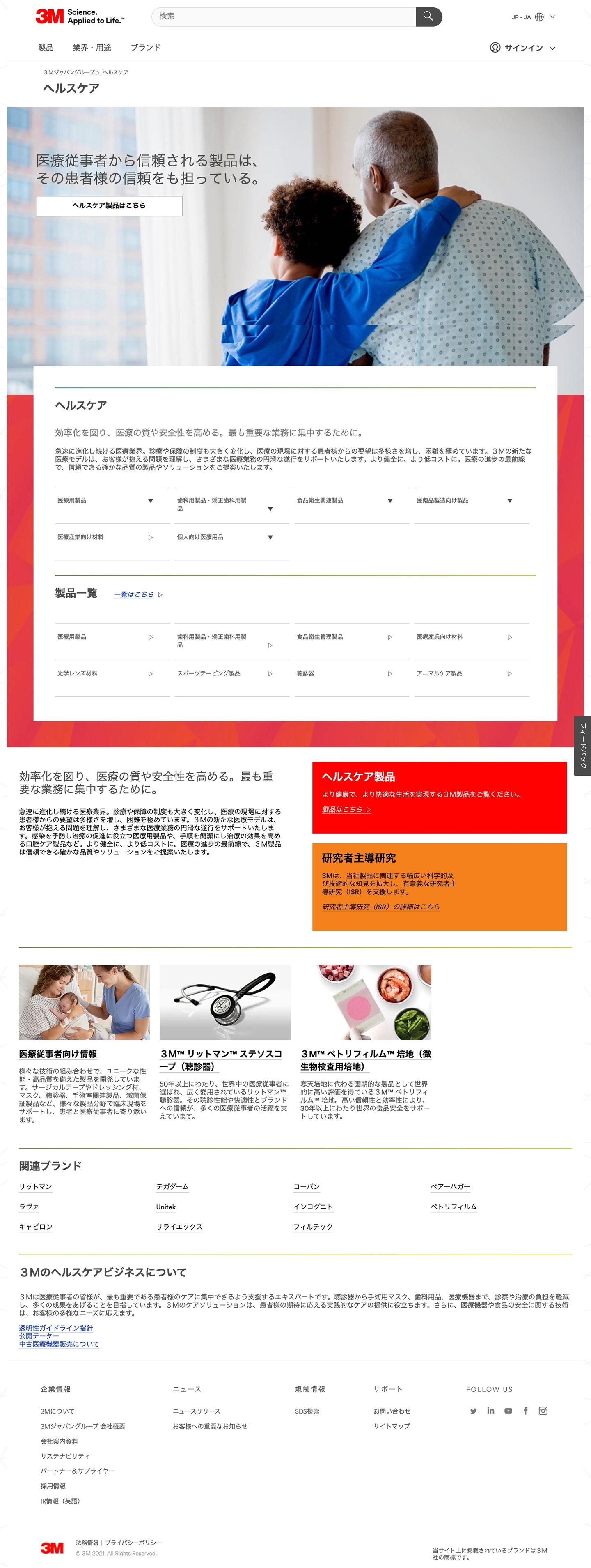
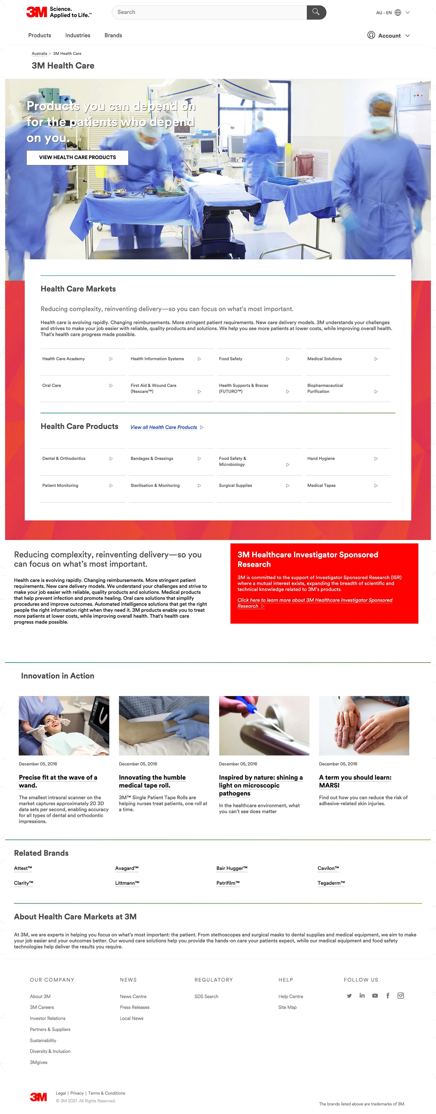
0 1. Design misalignment between Regional and global site
While the entire site structure is different, the design pattern library used on regional sites was also completely different from the global site. This inconsistency in brand look and feel induces in users a sense of incoherence and unreliability.
0 2. Local content is outdated
Information on the local APAC site was not relevant to the latest medical information and industry news, with some content dating back to 2017. Hence, the site could not fulfil medical professionals who wanted timely medical and health information.0 3. Call to actions conversion rates were low
Utilising adobe analytics on the APAC sites, I noticed that many of the updated healthcare stories links had zero click-through rate. Individual product category links did not necessarily retain high click rates.0 4. Content dissimilarity between Regional and global site
While existing regional sites lacked information compared to the global site, global content was also not relevant to be included in the local market and hence redundant.New Global Site

Japan Outdated Site
Australia Outdated Site
S O L U T I O N S
Optimised and localised global site
A cleaner and targeted site with streamlined information tailored to each country’s healthcare professional’s needs.Prominent call to action
Eye-catching call-to-action links such as images convey concepts and reinforce information provided in the text. It also attracts and engages user attention to click on links.Up-to-date content
Value-added content relevant to current healthcare affairs allows medical professionals to relate better.P R O C E S S
Discover
Stakeholder Alignment
Stakeholder Alignment
Empathise
User Persona
User Persona
Explore
Data Analysis
Site Audit
Data Analysis
Site Audit
Design
Optimisation
Localisation
Optimisation
Localisation
Ideate
Quality Control
Next Step
Quality Control
Next Step
* Disclaimer *
Due to the confidentiality of this project, the extent of work presented on this page has been limited in accordance with a non-disclosure agreement with 3M. All information in this case study is my own and does not necessarily reflect the views of 3M.
D I S C O V E R
Stakeholder Alignment
To begin the project, I evaluated and researched boundaries within the scope set by our client, 3M healthcare. I looked into the global strategies of 3M to align the information on the healthcare site with the overarching brand identity and core values of 3M. This allowed us to construct a healthcare landing page focusing on the 3M business market segment.
Upon aligning with the global marketing strategy and business goals, I came up with a few goals which guided the restructuring of the site to suit the local market better.
1.
Similar to the “About Us” page but focuses specifically on each segment of 3M business
2.
Answer questions visitors may have about who we are as a company and help them decide if they want to do business with us
3.
Showcase 3M healthcare’s expertise and capabilities in that area
4.
Promote the business behind the healthcare products
5.
Explain what sets 3M healthcare apart from the rest within that industry
6.
Introduce visitors to product categories which could cater to their needs
D I S C O V E R
Key considerations
I observed that 3M visitors who sought to learn more about the company would take the initiative to navigate to those relevant pages once on the site. Hence, the healthcare landing page was created.
NOT as a product promotion or product selection tool
NOT as a marketing tool
NOT as candidates for search campaigns other than branded terms (3M Health Care)
E M P A T H I S E
User Persona
Working with the global team in alignment with the global strategy guidelines, I defined the target webpage users as those in the customer journey's early awareness stage. It is not for and typically doesn’t appeal to those looking for specific products or solutions to a defined problem.
Potential investors, companies and individuals are interested in working with 3M healthcare.

Current distributors interested in expanding their sale of 3M healthcare’s products and who are seeking more information about the products they are unfamiliar with.

Users evaluating 3M as a company and comparing them against other competitors or looking for validation of 3M’s expertise and capabilities

Individuals interested in working at 3M
E X P L O R E
Data Analysis
Before kickstarting the design process, it was essential for us as a team to define the project's success and understand the scale and health of the user experience. Using adobe analytics, I studied the current 3M Healthcare site traffic for all APAC market sites involved in the replication project. These data are valuable insights for me to explain my design solutions to the clients.
1. Device Access
Unexpectedly, our data revealed that users tended to access the desktop site more often than the mobile site. This is a favourable finding since the existing global design pattern library was built for a desktop-first approach, which was the method I eventually adopted for the wireframe design.

*Data has been modified for visualization purposes.
2. Clicked Through Rate
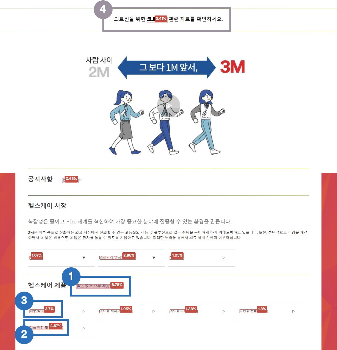
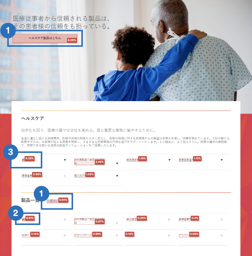
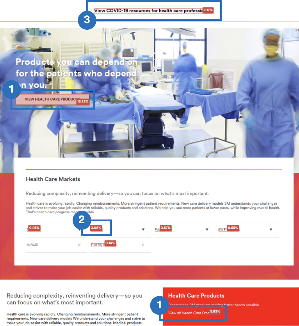
Using Adobe Activity Map, I examined user interaction hot spots and user click-through habits. The data showed that links placed on the lower part of the page had a significantly lower click-through rate. I also identified the links that retained the most user clicks despite being scattered throughout the site. Using this information, I took action to bump both “hot-spot” links and links local marketers wanted to increase traffic up to the top fold of the page for quick and encouraged access.
K O R E A
![]()
J A P A N
![]()
I N D I A
![]()
E X P L O R E
Site Audit
Before localisation, the team assessed how the global base site could be adapted to different target markets. A site audit was necessary before proceeding to the conceptual stage of developing the web pages. The site audit entailed identifying differences in site structure, gaps in content, and usability issues in regional sites. The goal was to create design solutions that could scale and extend to any combination of adaptations.
Content Audit
The global base site is not quite constructed for adaptation and localisation. Comparing local and global sites, I realised that the global base included several US content irrelevant to the APAC market. There were also many content gaps within the regional sites. Working with the content strategist, we strove to streamline and contextualise the content to the target user market.Usability Audit
Good usability, as defined by our team, entailed a clear, simple webpage, easy to pick up and efficient in taking users where they wanted to go. Inspecting the global base wireframe with reference to previous research data, which encompassed the whole range of impressions, likes, or dislikes users had when using the site, I noticed that the global base user interface did not quite support the ideal ‘good’ usability.D E S I G N
Optimisation
I optimised pages based on past data and audit results.
REDUCTION OF PAGE LENGTH
1. Repetitive sections were removed to reduce page scroll2. Large volume text which did not value-add to the site was removed to reduce distractions
3. Drastic page length reduction eliminated the use of the “jump to menu” bar
4. The Call to Action banner was removed by integrating content into other sections
PRIORITISING AND ORGANISING INFORMATION
1. Featured content was shifted up to the top fold such that new users could focus on exploring highlighted markets and product ranges while old users could quickly reach frequently accessed information2. Product section was categorised, enabling users to make clear distinctions between different product ranges quickly
3. Prioritised Covid-19 news bites over general medical stories, offering users information of imminent relevance
4. Addition of supporting images helped users to associate and identify product usage better
5. Content inapplicable to the APAC region was removed to ensure that only relevant and useful information would be communicated to the users
6. Career section was moved from the footer’s text link, allowing users to focus on the featured content.
IMAGE UTILISATION
1. Leveraged on larger images relevant to published content to draw user attention to featured articles2. Smaller images are assigned to low-priority articles to prevent distraction from featured articles such as those focused on COVID-19.
3. Wordy hyperlink texts were omitted and featured stories were selected to catch user attention
D E S I G N
Site Localisation
Based on the above user data and analysis, and using the business goals and objectives given by the stakeholders as a guide, the project was embarked upon to adapt the site’s user experience for local expectations, giving users the feeling of comfort, familiarity, and ease of use in whichever corner of the globe.
1. Localised Visuals
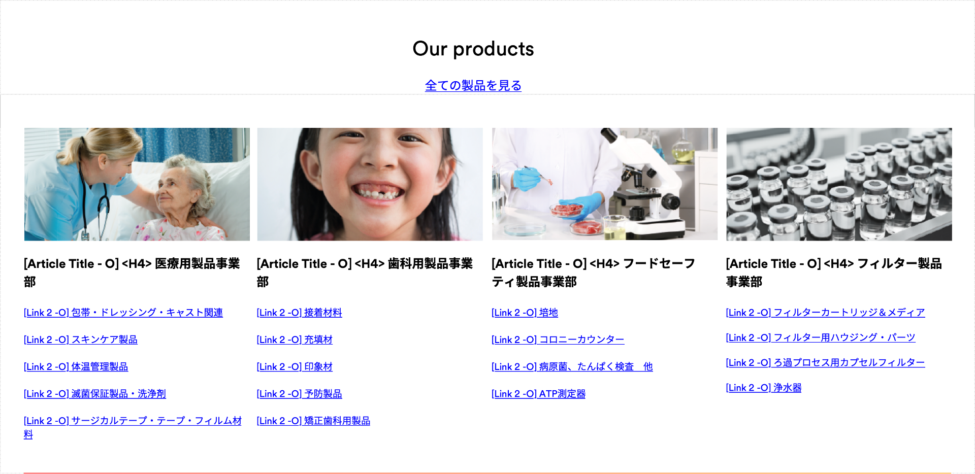
Utilising images which were specific and relatable to users from each target cultural background was ensured from the start of the development process to deliver the best solutions for 3M healthcare’s business whilst respecting their users.
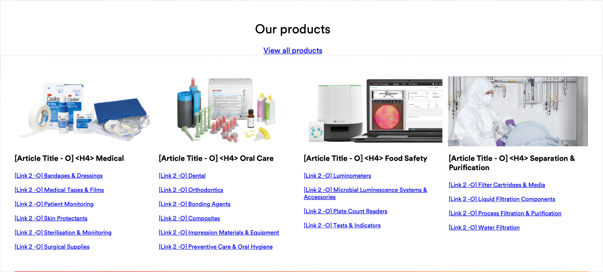
I replaced image assets for each market to better suit the products and appealed to the local audience. This entailed both careful considerations of user needs and content adaptation to deliver its whole meaning for each new location or culture. Special care was also taken to verify the visual's cultural appropriateness.
Images that allow users to relate tend to be immediately recognisable to users, simplifying navigation for an easy and frictionless user experience
A U S T R A L I A
J A P A N
K O R E A

2. Customised Graphics
Icons played a significant role in communication as standard and recognisable representations of different elements. Referencing the existing global icon, I designed new icons to effectively represent healthcare markets that were not covered on the global site. A consistent design style was imposed throughout all the new icons so that no icons would look out of place.
Markets unique to the local country include Liquicel, Food and Beverages and Water Quality related products. Each of these healthcare icons communicates the functionality of its relevant products, which might be of value or interest to users.


3. Localised Content
Users want the feeling of comfort, familiarity, and ease of finding the content that they used to have. I heavily leveraged the data gathered on local users' interaction with existing site content, and embedded site links to identify local content or frequently accessed features. With this information, I integrated these content or features while streamlining the presentation and organisation of these features or content.
For example, based on my analysed data, there was a fair portion of people accessing the Naver blog site in Korea featuring KR 3M healthcare blog posts through an existing link on the landing page.
Local marketers wished to draw further attention to this accessed section which offered value-adding content for users, so I made a highlighted call-to-action banner linked to this blog site. However, since the page length was kept relatively short and there was more critical content to be featured, I kept the link at the bottom of the fold for those already accustomed to accessing the site. The goal was to ensure an easy and frictionless user experience.
O L D
![]()

N E W

I D E A T E
Quality Assurance
One of the most prevalent mismatches between mock-ups and the actual layouts was inconsistent margins between blocks. The inconsistencies, even in the minute details such as a 5-pixel shift, greater line height, or incorrect border radiuses, added up and diminished the design work.
Underlying Issue
However, these issues were due to a systematic problem in the 3M design pattern library. As communicated by the global design team, the DPL’s were passed through many different developers, designers, and bug fixes over nearly a decade.Simply adjusting the padding on the global design was not an option, as there was the possibility that an adjustment would affect other 3M sites which followed the same design pattern library system. The amount of testing involved to ensure that no other sites were negatively impacted was unrealistic for this project, given the project’s priority and roadmap.
‘Quick’ Fix
Therefore, to aid the developers in achieving uniformity in margins and paddings, I manually specified each fix required and colour-coded the different measurements to identify them easily. While tedious, this made the website look neater, which is also paramount to the user experience.However, not all uneven margins and paddings were fixed during development. Due to the assigned project timeline, only margins and paddings deemed to be severely affecting users' readability were singled out to be fixed. Other seemingly unnoticeable errors were set aside for further maintenance.
I D E A T E
Next Step
Margin Guideline
A margin system for creating a responsive website can be implemented to improve the website and development workflow further. A system With margins that could change heights according to each breakpoint will ensure that every one of these breakpoints has a predictable behaviour. This enables the webpage design to be easily adapted, providing the best possible user experience.designers would also have the ease of needing to only create a page layout with margin measurements once as a guide, without worrying about other screen resolutions. Subsequently, developers can easily understand how the margins change based on this guide, saving time and effort.
