Catering for Quality
3M Water Quality webpages provide water filtration solutions for residential, commercial and industrial applications.

M Y R O L E
User Experience andUser Interface Designer
T E A M
Aaron (PM)Melissa (Content)
T O O L S
Axure, XML, Adobe Analytics, Illustrator, Photoshop, Power PointR E S U L T S
pendingT I M E
2021-2022C L I E N T
The 3M Company operations span across various fields, including the industrial sector, worker safety, health care, and consumer goods.
O V E R V I E W
As a part of 3M’s Health Care Business Group team, I was tasked to replicate and localise 3M’s water quality global sites for Australia, New Zealand, Korea, Japan, India, Singapore and Malaysia. The project was split into three applications — Residential, Commercial and Industrial.
O B J E C T I V E
The 3M water quality pages aimed to promote its water filtration products as a solution to better water quality. This audit aimed to improve these sites' overall user experience to drive sales and generate leads.
A P P R O A C H
Using the existing pages as a starting point, our team optimised old content and tailored new site formats that were best engaged for 3M Water Quality’s target markets. A new landing page was created to be adopted across all APAC markets.
7
Countries70
Webpages200+
Image Assets12%
︎︎︎link clicksp r o b l e m
Users faced difficulties differentiating and choosing the right product solutions because the information presented on the site was tedious to digest, especially on the mobile site.
Users faced difficulties differentiating and choosing the right product solutions because the information presented on the site was tedious to digest, especially on the mobile site.
s o l u t i o n s
Users need more product details and gain convenient access through mobile device.
more product details
Enhanced product description page with infographics and product technical specifications for users to digest conveniently.
convenient access through mobile device
Restructure content for a shorter scroll length to cater mobile users.
P R O C E S S
Empathise
User FeedbackLearn
Sitemap ReviewDiscover
Site AuditData Analytics
Ideate
Content StrategyWireframe Iteration
Wireframe Framework
Design
Page OptimisationExplore
Next StepI D E A T E
Wireframe Framework
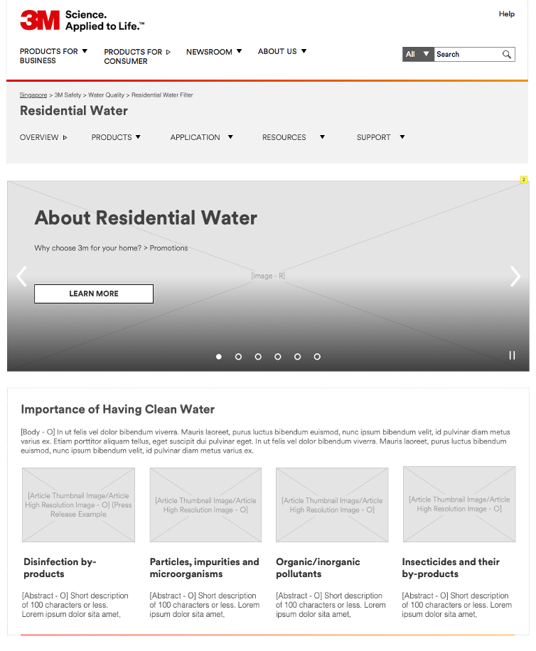
After several rounds of iterations, we finalised the flow of the content and I came up with an improved lo-fi wireframe which refined and enhanced the 3m.com site experience. Every section of the page was designed to target a specific group of 3m.com users.
1. Top Fold

Carousel Banner
Carousel banner is limited to 2-3 images as click-throughs for subsequent images are low.
Carousel Banner
A quick guide on the importance of water filtration and how 3M products are a solution to the filtration process.
Targeting users who are familiar with 3M’s solutions
Carousel banner is limited to 2-3 images as click-throughs for subsequent images are low.
Carousel Banner
Targeting new users
A quick guide on the importance of water filtration and how 3M products are a solution to the filtration process.
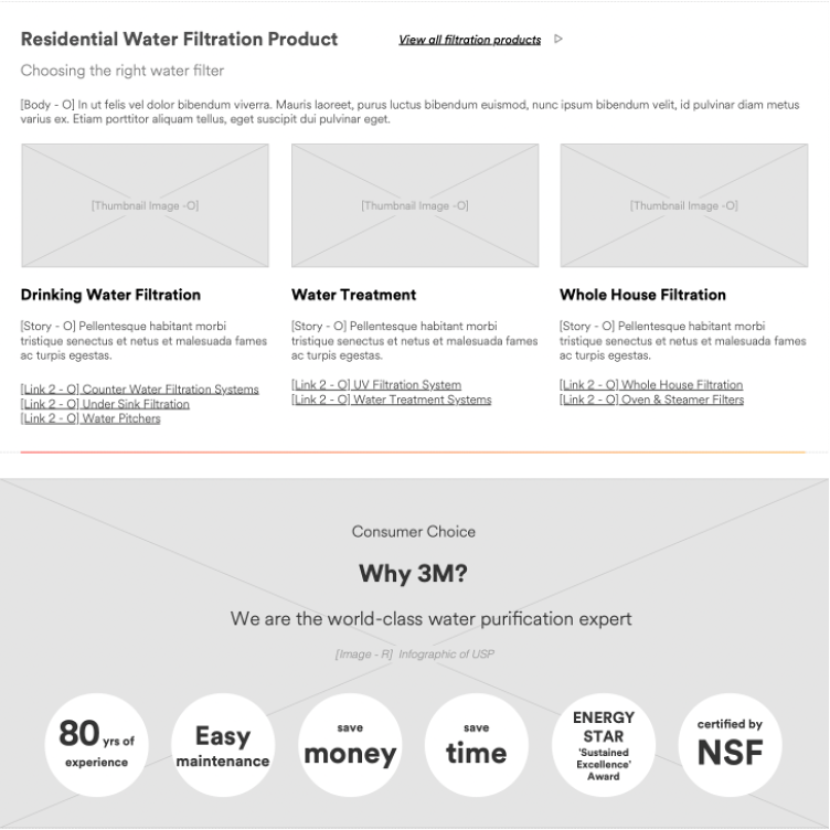
2. Bottom Fold

Product Categories
2-3 Featured product categories are displayed to allow users to get to specific product pages quickly. Product categories are kept simple for a shorter scroll on mobile devices.
Unique Selling Point
Infographics highlighting the brand’s USP and accolades displayed to introduce 3M as a trusted brand.
Targeting all users
2-3 Featured product categories are displayed to allow users to get to specific product pages quickly. Product categories are kept simple for a shorter scroll on mobile devices.
Unique Selling Point
Targeting new users
Infographics highlighting the brand’s USP and accolades displayed to introduce 3M as a trusted brand.
3. Bottom Fold

Customer Testimonials
Testimonials displayed to value add to 3M filtration products.
Targeting new users
Testimonials displayed to value add to 3M filtration products.
D E S I G N
Content
localisation
Optimised page templates for all markets were finally implemented.
1. Content and assets are localised based on every individual regional marketer’s feedback.
2. Product categories unavailable in the country‘s region were removed
3. Translation of text to foreign languages such as Japanese, Korean, Thai, Vietnamese and Bahasa Indonesian


D E S I G N
Page
Optimization
Besides creating the landing page, many existing local subpages were retained and will be nested within the water quality landing site. Most of the pages were outdated and required maintenance and updates.
1. Redesigned Infographics
Images significantly improve the readability and legibility of the content. I created new image assets to replace outdated and visually unpleasant infographics. These assets were carefully designed to keep the overall colour palette neutral, reflecting the concept of clean, quality water, harking back to 3M’s primary business goal.
2. Notable Product Information
Each product series has its product detail page. For users to quickly identify each product's benefits, it was important to ensure all product USPs were highlighted at a glance.3. Icons
Graphics work harmoniously with texts, are eye-catching, and allow users to decode information faster. I designed each text block to be accompanied by a visually captivating icon representing its selling point.Different shades of blue were chosen for their psychological association with ‘clean’, ‘crisp’, or ‘refreshing’ elements. The use of blue gradient line strokes also resonates with the 3M colour system and brand guideline, signalling a sense of brand identity. Psychological association can be a powerful tool in gaining users' trust. All existing sites were updated with the redesigned graphics for consistency.


4. Digestible Content
Working with the content strategist, texts were re-organised in a concise, descriptive and eye-catching manner. The reorganisation of information was necessary for redesigning the presentation of the copy so that all users could easily access important information and convince them to read more.• Visual Divider
I employed images, graphic elements, and infographics to break up long articles and provide a visually engaging key point.
• Visual Representation
The Content Strategist and I scanned content to find key points and information to create infographics highlighting essential information to make content easily digestible and readable. Unspecialised or new customers could navigate easily too.
• Content Headings
I organised the content into blocks with visually captivating subheadings, which our content strategist worded. Titling allows users who want in-depth product information to locate it quickly.
• Content Block
Content blocks shorten text fragments and have a continuous flow for easy scanning. This allows users to grasp the content at a glance and preview the most crucial information quicker.
E X P L O R E
Next Step
After the audit and restructuring of the site, I continued to look at the optimised pages to continue recommendations & improvements where necessary.
Issue
During the quality assurance process, I noticed that margins on the staging site did not match the wireframes. Specifically, the margins were inconsistent and caused issues with the segregation of content and distorting the design, disrupting the page flow.Difficulties
After communicating with the developers, I understood their working process and learnt that the uneven margins resulted from utilising the global design pattern library code.To match the staging site with the wireframe, they would have had to tweak the code manually to adjust each margin or padding to be consistent throughout the page. This would have been an incredibly laborious and time-consuming process.